Project Overview
CHALLENGE
Twoha’s Cafe is a local bakery café located in Duluth, GA. They currently solely rely on social platforms such as Yelp, Facebook, and Instagram to promote business, however, they have the more unexplored potential to connect with their users to grow their business.
SOLUTION
Design a mobile ordering app that meets the goals of the business and users
Digital branding that effectively portrays Twoha’s unique personality
MY ROLE
UX, UI Designer
Research, Visual design, Prototyping, User Testing
TIME
May 2024 (4 weeks)
TOOLS
Figma, Procreate
Design Process
EMPATHIZE
Research
Through market research, competitive analysis, and user interviews, I developed a deeper understanding of Twoha’s landscape and customers.
Research Goals
Understand the market trends of the Bakery/Cafe industry in Duluth, GA.
Identify Twoha’s target market
Identify Twoha’s competitors and evaluate strengths and weaknesses
Understand the experiences people have online and offline
Discover pain points that people encounter online and offline
Market Research
I started with market research to understand the general market, consumer, and ordering trends in order to gain a fuller understanding of the market Twoha’s participates in.
Market Trends
The U.S. bakery café market was valued at approximately $12 billion in 2023 and is projected to grow at a compound annual growth rate (CAGR) of 4.5% through 2027
The bakery sector saw significant price increases due to inflation, with bakery prices rising by 15.3% in Q1 2023 compared to the previous year
Despite high inflation, sales in the perimeter bakery segment increased to $18.1 billion for the 52 weeks ending July 30, 2023
Major corporations dominate the market, with 55% of all baked goods in the US produced by three major companies
Consumer Trends
Millennials (ages 25-40) and Generation Z (ages 10-25) are the primary age groups visiting bakery cafes.
40% of consumers prefer bakery cafes that offer online ordering, delivery, and curbside pickup.
45% of bakery cafe patrons prefer cafes that offer customizable options
66% of global consumers are willing to pay more for sustainable brands
IBISWorld reports that bakery cafes with robust online and mobile ordering systems have seen increased sales and customer retention.
Mobile Ordering Trends
71% of consumers have used mobile ordering, reflecting a significant increase since the pandemic
Digital orders, including mobile, contribute to approximately 50% of total restaurant revenue
Customers place 30-40% more orders per month via mobile apps compared to traditional online ordering
68% of consumers use mobile ordering primarily for convenience
35% of customers engage with loyalty programs offered through mobile apps
Sources
Competitive Analysis
Provisional Personas
Using the insights gained from my research— reading reviews, reddit threads, and comments, I created provisional persona to represent potential users.
User Interviews
I conducted interviews with 5 people, about 20 minutes each.
Some questions asked during the interview:
How often do you visit bakery cafes?
How do you typically discover new local cafes or bakeries?
When you visit a new cafe, what is your preferred method of ordering? Why?
What factors contribute to your decision to return to a cafe after your first visit?
If a local bakery cafe had a mobile ordering app, what features would you find most beneficial?
Can you describe any challenges or frustrations you’ve experienced when ordering from cafes, either in-person or online?
Empathy Map
Using an empathy map, I summarized and organized all the information I gathered during the user interviews to identify any patterns and synthesize key insights that will help me understand how to design for Twoha’s customer base.
Patterns
Preference for Mobile Ordering and Online Menus
All participants expressed a preference for using mobile apps to order and the importance of having the menu available online.
Insights
Value of Loyalty Programs and Special Deals
Participants frequently mentioned the importance of the cafe’s environment, including aspects like comfortable seating and welcoming atmosphere.
People prioritize convenience and time-saving features in their ordering experiences.
While the mobile app cannot directly control the physical environment, it can reflect the cafe’s ambiance through its design.
People appreciate being appreciated. Loyalty and rewards programs go a long way.
Importance of Atmosphere and Ambiance
Several participants highlighted the appeal of loyalty programs, student discounts, and special deals as factors that encourage them to visit and revisit a cafe.
Needs
To quickly and easily place and follow their orders through the app
To resonate with the mobile app's visual branding that reflects physical ambiance
To receive appropriate rewards for consistent and loyal patronage
User Persona
Based on my research, Emma would most likely be a common customer at Twoha’s Cafe.
DEFINE / IDEATE
Defining the Problem
To help define these problems, I used the insights gained from research and interviews to create POV statements from Emma’s perspective. Then, I use the persona and story to craft How Might We questions that will guide my ideation process. Below is an example of my process:
How Might We…?
Based on the POV Statements, I brainstormed several HMW questions that could solve Emma’s problem.
Brainstorming
I focused on certain HMW questions and brainstormed different ideas.
Task Flow
Task flow of ordering a drink from the menu.
User Flow
Emma’s process of ordering a drink ahead of arriving to the cafe for a long study session.
Strategizing
Given that the cafe is a small business, I wanted to strategize and determine which solutions should take priority not only for the sake of the user, but also for business feasibility.
Project Goals
I created a Venn diagram to visualize user goals and business goals. Comparing and contrasting the two would help guide decisions moving forward to ensure I was moving towards a well spliced design.
Product Roadmap
Based on the goals I defined in the Venn diagram, I started making decisions on what solutions should take priority to successfully and effectively meet those goals.
Design / Sketch
Lo-Fi Wireframes
Design / Prototype
Building a Prototype
Lo-Fi Digital Wireframes
Mockup
Usability Testing
Test Objectives
Test if users can easily complete the tasks
Observe the different paths users take to complete tasks
Assess areas of improvement to improve the usability of the design
Tasks
Prompt 1: Order a Mocha
Prompt 2: Check your reward points and status
Prompt 3: Change or add a payment method.
Summary
I conducted testing with 3 participants and observed how they interacted with the prototype and completed the tasks.
Method: Remote, moderated usability testing (Think Aloud)
Participants: 5
Age: 20-26 years
Average Time: 15 minutes
Affinity Map
To better identify patterns and synthesize insights, I used an affinity map to synthesize my findings
Amongst the patterns I uncovered, I was able to identify common pain points amongst our participants.
Pain Points
Contents of the homepage doesn’t resonate with users needs
Information on the Points Redeem page wasn’t organized intuitively.
Reward perks and exchange wasn’t transparent to users.
The connection and flow between each screen needs to be reviewed in more detail
Design needs to be more consistent but also needs to be more engaging and fun
Design / Sketch
More Sketches…
Based on user feedback, I felt that there were several improvements and changes in design that were needed, so I revisited sketching to approach the problem from a different perspective to better meet user needs in my designs.
And Even More Wireframes…
Design / Prototype
Mockup Iteration
Prototype / Test
Usability Testing
Test Objectives
Test if users can easily complete the tasks
Observe the different paths users take to complete tasks
Assess areas of improvement to improve the usability of the design
Tasks
Prompt 1: Order a Mocha
Prompt 2: Check your reward points and status
Prompt 3: Change or add a payment method.
Summary
I conducted testing with 3 participants (3 participants from the first round of usability tests) and observed how they interacted with the prototype and completed the tasks.
Method: Remote, moderated usability testing (Think Aloud)
Participants: 3
Age: 22-25 years
Average Time: 15 minutes
Affinity Map
To better identify patterns and synthesize insights, I used an affinity map to synthesize my findings
Summary
Participants appreciated the clean design and improved icons but found the color scheme too soft or childish and felt it should better reflect the café's cozy ambiance.
Users highlighted the need for better feedback and responsiveness in the app, including interactive elements, intuitive toggles, and confirmation screens for actions.
While navigation was generally seen as familiar and convenient, there were concerns about redundant options and suggestions to reorder items for better clarity and ease of use.
Overall, the app's simplicity was appreciated, but key features need to be more prominent and a few steps could benefit from additional guidance or feedback.
Feedback and Priority Revisions
Color Contrast
In general, the color theme didn’t resonate with the test participants, but it was expressed multiple times that the color combination of blue and yellow did not make enough of a contrast. To fix this issue, I played with several different color palettes before ultimately making a final choice.
The final colors come directly from the cafe’s digital branding via Instagram.
Before
After
Improved Progress Tracker
The map was unnecessary as there is only one location, so the steps of the progress tracker was altered to reflect information that would be more relevant to users.
Old Confirmation + Tracker
New Confirmation + Tracker
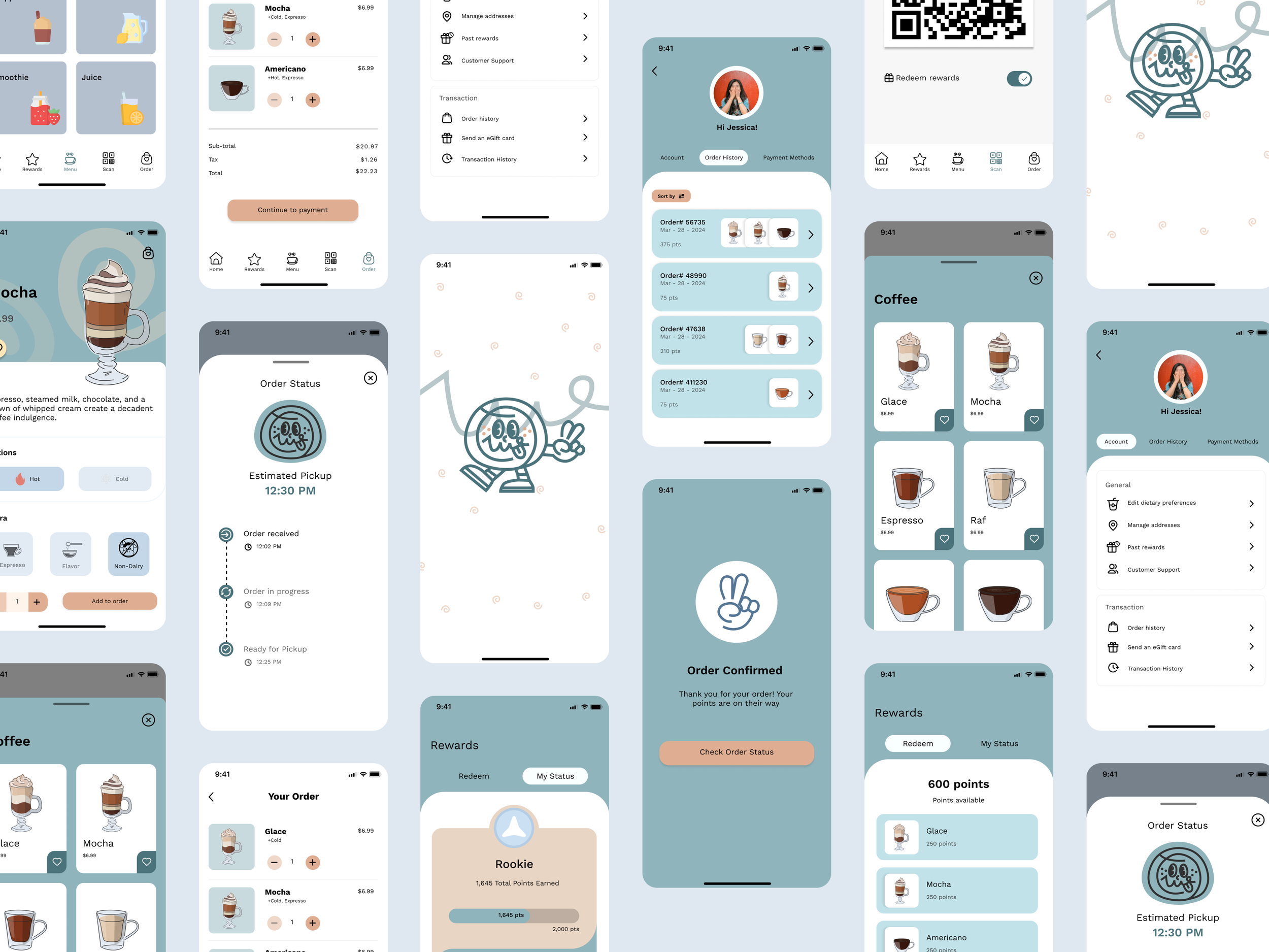
Final Mockup
Reflections and Takeways
I explored a new approach for this project by putting a lot of focus on ideation through several HMW sessions and crazy8 sketching sessions before creating any kind of digital wireframe. I think this method was really effective in getting ideas out quickly without worrying and getting caught up in details, and as a result, I felt that there wasn’t too much of a struggle making final design decisions later down the line.
If I were to push this project further, I would:
01 USABILITY TESTING
My last round of designs still need to go through another round of usability testing, and this time a more robust set of tasks would be necessary to ensure that all parts of the app meet user needs.
02 IMPLEMENTATION
With the timeline of this project, I could only focus on the top prioritized features to meet priority needs and goals. There’s definitely room to add to the experience via new features or better fleshed out aspects